![]()
Product Description
The Upshot is a sub-brand of The New York Times, begun in April 2014 under the direction of former Washington Bureau Chief David Leonhardt, with a staff of around fifteen Times journalists, designers, and editors. It was launched following the departure of Nate Silver’s FiveThirtyEight, though it does not attempt to mimic but rather be a spiritual successor of sorts.
What is a Sub-brand?
A sub-brand carves out a space within the larger “core” brand, in order to dive deeper into a certain area than the core brand could or would. Jesse Washington, a senior writer for ESPN’s new brand, The Undefeated, told me that the purpose of a sub-brand is to “go deep in places that might otherwise remain unexplored,” adding that “The main brand (ESPN) and the sub-brand (in this case TheUndefeated.com) are not mutually exclusive—they support one another.”
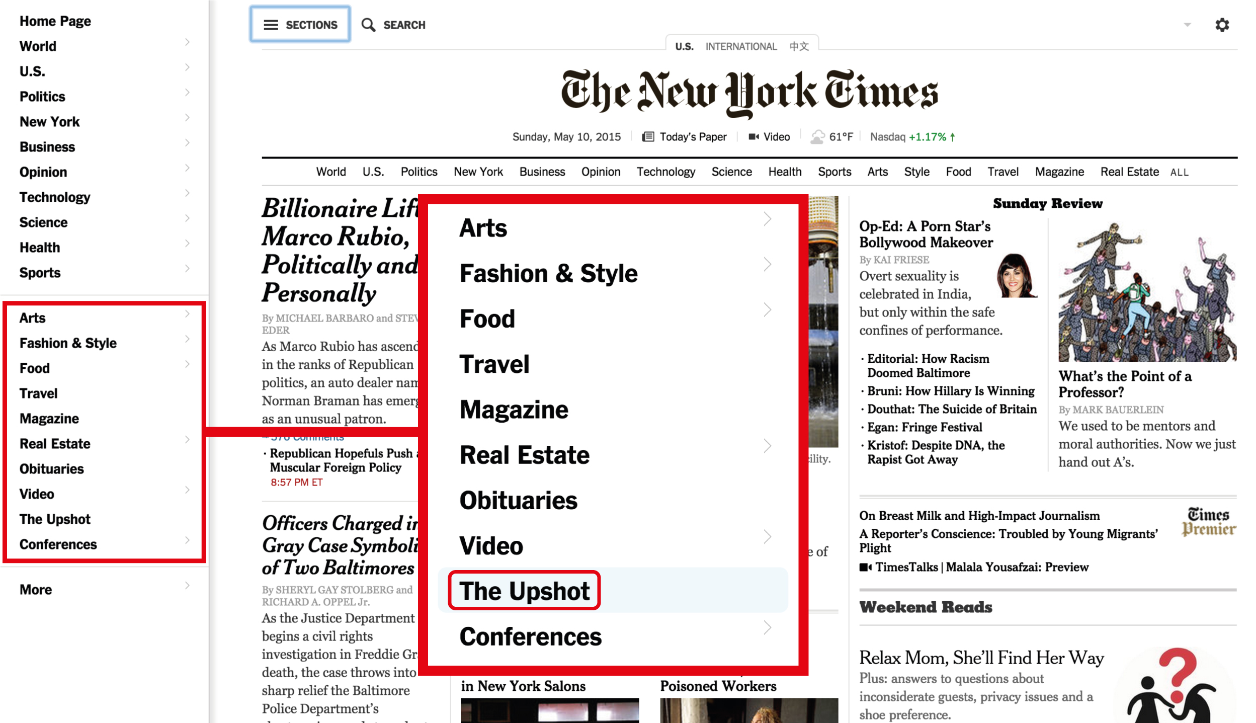
As a sub-brand, the Upshot is particularly notable because it is not classified as one of the Times’ blogs, and is not under any other section. In fact, it appears as a section itself in the Times’ homepage, as highlighted above. And yet it doesn’t have a “topic.” It has a mission: making events in the news and things in the world clearer, so people can converse about them, and cut through the fog with a certain confidence, as when we say, “The upshot of it is…”
What is data-driven journalism?
Data-driven journalism, as we understand it today, is a movement that started gaining force sometime in the 1970s. It is tied to what journalists once called Computer Assisted Reporting, or CAR. Naturally, all journalism involves finding, understanding, and using data. What sets data journalism apart from traditional approaches is that, rather than relying on interviews, memorandums, and press releases, the journalist looks to huge data sets that take the form of financial records, urban statistics, census results and polls, for example. The journalist then “interrogates” the data, as the Data Journalism Handbook refers to it, extracting meaning that would have been otherwise lost in the ocean of information. This involves using tools like computer models to look for patterns, comparing data sets to determine correlative relationships, and drawing conclusions from this research. The premise behind the approach lies in the assumption that truth can be derived from the information given the right method and the right perspective, and the idea that part of the journalists’ mission of public service includes the facilitation of “data literacy,” the ability for people to understand the data that affects their lives.
Strategy
In an interview with Nieman Lab right after the launch, Leonhardt said that “we decided quite quickly — maybe even in our first meeting — that we didn’t want to go out and replace Nate.” Instead, the focus became journalism on substantive issues that was “approachable,” and whose tone was more journalist “sending you an email” than writing in the paper. The goal, if it can be boiled down to its basest form, was to not only inform but to bring the murky into focus, using raw data as a backbone.
It could also certainly be argued that the Upshot is the Times’ first flirtation with a newsroom workflow that transcends the traditional structure of a printed news article and truly embraces the “digital first” mantra. This includes a blunter way of communicating with readers. How hard is your county to live in? How does your birth year affect the way you vote? There’s certainly a lot more “you” in it than in the rest of the Times.
Speaking about Nate Cohn, a young journalist he hired who is good with data, Leonhard said, “When we’re talking about stories, there’s never that moment where I have to say to him, ‘Do you care if this doesn’t run in the paper?’ He’s part of a change where people have realized one is not better than the other.” This too is “digital first.” Some of the Upshot’s interactive features would barely make sense as print stories. They are born digital.
An article in Fast Company from January 2015 described the Upshot as having a staff of 17: three graphics editors, six reporters, five editors, a photo editor, and an art director. It’s interesting that such a small, self-contained section has such a variety of skills represented among its staff, hinting at a desire to make a different kind of product than is made in the rest of the Times. It’s an experiment in news presentation, and has the varied talent to be effective.
Conspicuously absent from the Upshot is the sort of “he said she said” reporting that still exists in other areas of the Times; the assumption here is that the data sometimes tells a definite story that no amount of cross-aisle bickering and ideological disagreement can refute. The result is a kind of journalists-telling-it-like-it-is approach that can initially be disconcerting, but is ultimately refreshing.
The Upshot exists within the same sphere as other “explanatory journalism” outlets like Vox and the Washington Post’s Wonkblog. In a Quartz interview, Leonhardt, apparently referring to these as well as FiveThirtyEight, stated that there “are certain similarities in all of these ventures, but there are also differences. I think the audience for this journalism is large, growing and underserved.” He did not specify who exactly that audience was, but the comment suggests this audience is somehow different or broader than the “core” Times reader. I believe the Upshot broadens the Times audience by keeping an eye on shareability. Though it seems that at the Times, concepts like “shareability” are regarded, at best, with mild disgust (as clickbait) the Upshot might be the first step towards easing the automatic association between greater shareability and loss of quality and identity.
Key Features

In digital journalism that is much excitement around the creative use of graphics, graphs, timelines, maps, and other colorful visual, often interactive elements. The good news is that these are not a gimmick or a crowd-baiter. I would argue that the kind of interactive, graphical presentation that the Upshot is pioneering is actually an integral part of the journalism. It is “supplementary” in the way that sunglasses on a bright day might be supplementary: what you’re looking at isn’t changing, but the clarity of your perception is certainly affected.
The reason has much to do with the “data-driven” nature of the Upshot’s journalism. For most people, spreadsheets full of data are remarkably unengaging, which is a problem when this data is crucial, or has the capacity to illuminate an issue. To represent patterns of migration across the United States, words and numbers alone probably wouldn’t do. But an interactive map? Anyone can understand that.
Another notable feature is the Upshot’s straightforward, bite-sized articles. Most hover between six-hundred and a thousand words, and deliver a mix of statistics, analysis, and commentary with few unnecessary words. They have found an advantage in the narrowness of their focus, with each post zeroing in on a very particular issue, and oftentimes a very particular assertion within that issue (Rand Paul’s Donations Show His Small-Town Appeal). The step-by-step approach and frank tone help the Upshot accomplish its goal of enabling a non-expert reader to speak, and speak intelligently, on complex issues.

Examples and Competitors
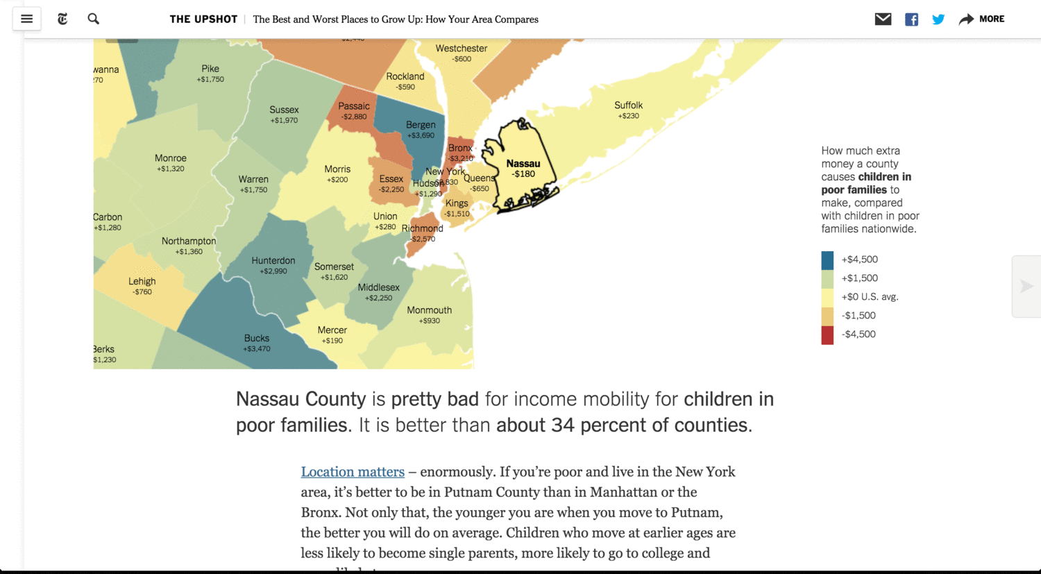
In the May 2015 Upshot post The Best and Worst Places to Grow Up: How Your Area Compares, the content of the article is determined by where you click on a large, interactive map. In trademark Upshot fashion, the article is largely the analysis and repackaging of otherwise dense information into a format that the average reader will understand. Like much of the Upshot, it comes across almost like advice from a well-informed friend (should I buy or rent?), though it has taken the next step in reader rapport by actually changing with the reader. This one is part of a series of articles that the Upshot has produced to discuss a study by two Harvard economists, a study that most people outside of an academic setting would likely not have been able to decipher. This is a case of exploring something in a way that the core Times brand likely never would.
A large part of the Upshot’s appeal comes from similar efforts to customize the information experience to readers.
Direct Competitors
FiveThirtyEight.com: Named after the number of members in the United States Electoral College, FiveThirtyEight was launched by the journalist and statistician Nate Silver in 2008. It began as a blog that revolved around the 2008 U.S. presidential election, where Silver, under the pseudonym “Poblano,” published electoral predictions that proved more accurate than pollsters’ projections. He developed a proprietary statistical model that involved demographic and voting data, eventually predicting the winner in 49 out of 50 states. The Times acquired licensing rights to and began publishing the blog in August, 2010. In July, 2013, ESPN announced that it had bought the FiveThirtyEight website and brand, relaunching it in March of 2014. Currently, the site has politics, economics, science, life, and sports sections, all operating under the mantle of data journalism.
Vox: The Vox Media-run news site was launched in April 2014 by Ezra Klein, formerly of The Washington Post. It joined a growing roster of digital-native sites started by Vox Media, including the technology site The Verge and the gaming site Polygon. The site’s tagline is “Explain the News,” and it has become well-known for its Card Stacks, a feature that seeks to break down significant events through series of simple, explanatory cards, one card per “thing” you need to grasp to understand the whole. For example, the recent “The Baltimore protests over Freddie Gray’s death, explained” stack. The stack goes through the arrest of Gray, his death, and the riots before diving into Baltimore’s demographic statistics and racial and police climate by way of context.
Wonkblog: Started by Ezra Klein while he was still at the Post, Wonkblog can be seen as a sort of precursor to Vox. It dealt largely with policy matters, featuring Klein and other policy reporters. The approach is less data journalism and more news analysis and commentary with an explanatory mission and plenty of voice— plus charts. Vox incorporates the attitude while adding the data journalism aspect, better design and attempted innovations like the card stack. When leaving the Post to form Vox, Klein said “We are not just trying to scale Wonkblog, we want to improve the technology of news.”
Comparing Story Presentation: Ted Cruz Announces Presidential Bid
Below is an analysis of four separate articles looking at Ted Cruz’s entrance into the 2016 presidential campaign as a candidate for the Republican nomination.
New York Times Politics and The Upshot:
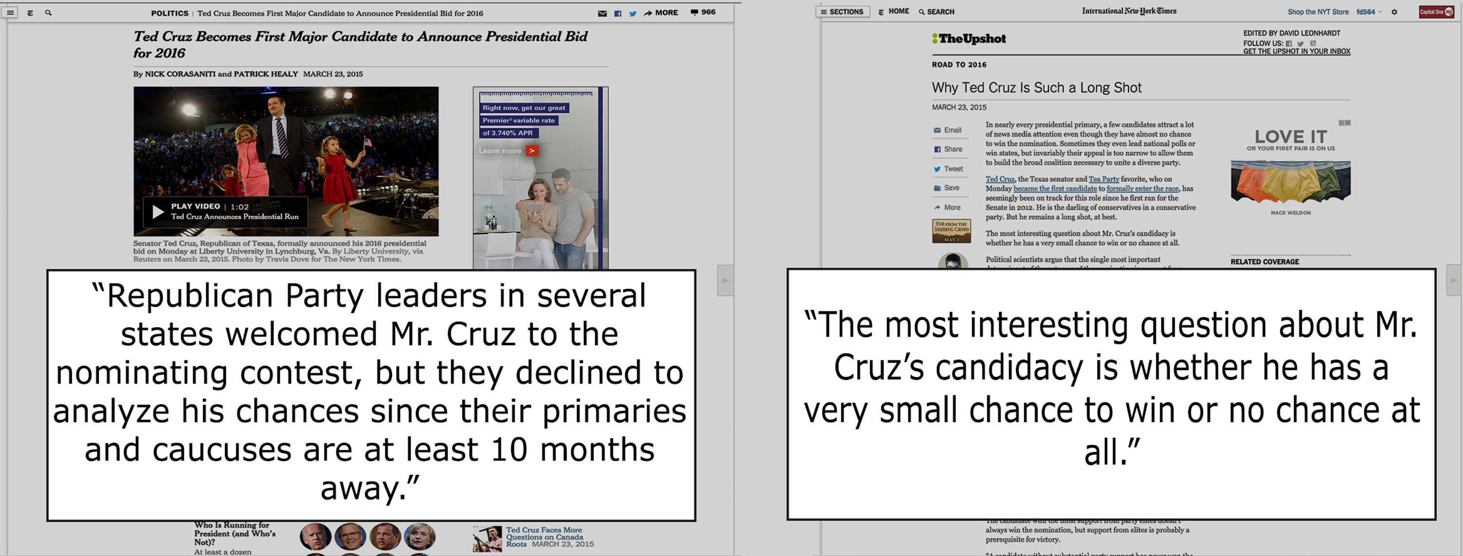
| The New York Times Politics | The Upshot |
| When Cruz announced his candidacy, the Times political section launched into the usual candidate coverage mode, with a description of Cruz’s speech, a rundown of his past positions and activities, and an smorgasbord of quotes from strategists and politicians. It stays in the middle of the road and it certainly doesn’t make any assessments about his chances of wining beyond what’s already been said by the sources. Its intent is to inform the public, even include some mild analysis, but not to predict or to provide assessment. | The Upshot, article, in turn, is titled Why Ted Cruz is Such a Long Shot, already striking a very different kind of tone. The post does not discuss his policy proposals, instead focusing entirely on the probability of Cruz winning the Republican nomination (which, apparently, is very unlikely). This is a clear shift in focus from a more ’rounded’ news article to a story with a clear data-based predictive intent. Notably, the tone of the piece is conversational in a way that could even be considered a bit snarky. It’s not trying to be a balanced piece, but rather to tell you, based on the expert opinion of journalist Nate Cohn, what is probable. |
Wonkblog and Vox:

| Washington Post Wonkblog | Vox |
| From the beginning, the article is astoundingly hard-edged. If the Upshot piece has a little bit of snark in its voice, this one really seems to want to push the envelope. As with the Upshot piece, it has a narrow focus on the larger news event (Cruz’s flat tax proposal within the context of his announcement). Similarly, the assertions made are based on data, with the journalist Matt O’Brien attempting to debunk the idea that a national flat flat tax would lead to sustained economic growth. | This article took a somewhat different approach, in that it relied less heavily on raw numbers and data and more on a kind of ‘if x then y’ assessment of Cruz’s proposals and possibilities. Like the Upshot, it seems to strive to equip the reader with the tools to be able to have a relatively informed conversation regarding the platform from which Cruz is launching, and to understand the kinds of directions that he has the possibility to go in given his background. It is very much “explanatory” journalism. |
Conclusion
Explanatory journalism, says David Leonhardt, succeeds when “someone who isn’t an expert really understands it. Understands it so well that they could turn around and explain it to somebody else.” This is conversational approach at level deeper than the tone in which articles are written. At its best, the Upshot makes it easier for readers to talk about the news with other people— to converse knowledgeably.
Key Links
- The New York Times Launches the Upshot – Press Release
- Quartz: “The Upshot” is the New York Times’ replacement for Nate Silver’s FiveThirtyEight
- Neiman Lab: Q&A: David Leonhardt says The Upshot won’t replace Nate Silver at The New York Times
- Fast Company: The Upshot: Where The New York Times Is Redesigning News
- Advertising Age: The Upshot Emerges as Potentially Lucrative Franchise at The Times
- New York Magazine: Upshot is reason #42 to love New York